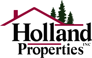
Fix it Fridays 01 - Holland LOGO
“How would I improve this?"
Recently I saw the Holland Properties logo on a truck in traffic and felt inspired to remix it with the goal of elevate the company's first impression.
First I wanted to go through what was bothering me about this logo.
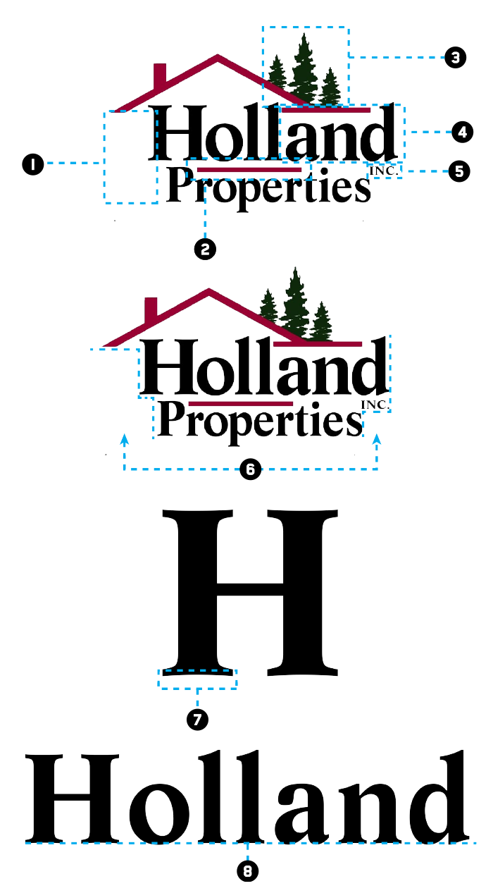
Very large space/gap. It appears this is created due to the roof above the logo; visually however, it’s a very very large gap.
This red bar appears to be placed to fill in the negative space between the two words. I don’t see why else it would be there.
Are we selling properties or trees? I realize this is added to relate to the Pacific Northwest; however in reality it’s introducing a 3rd color and a distracting element.
The flat part of the roof draws a lot of attention to the word “and….” and all I can see is AND!
INC is placed at an awkward location. Holland INC Properties?
The text is stacked very unbalanced.
The font used “Life Std Bold” has arches on the lower part of a bunch of letters. Visually I feel the letters would be more powerful if they were flat.
Additionally the letters don’t align flat to each other. This was bothering me….
With those points in mind I wanted to explore versions of the logo using as many of the same elements as possible. Although the direction was improving I was still not in love with any of the potential directions/solutions.
The second option was to separate the logo mark from the type. Since I knew what I disliked about the type I started with that. In addition to fixing the letters I created two versions that could be used depending on the layout.
For the actual mark I wanted to utilize elements from the original logo. Even though using a house for a real estate business isn’t the most exciting idea… I get it. So with that I wanted to explore the idea of combining a house with the letter H of Holland. The challenge was to not go over the top with the idea of a house. Additionally not to lose the H.
In the end I found this to be a great combination. Originally I did not have the RED block around the logo, but found it felt a little boring and not structured enough.


