Fix it Fridays 02 - AFC LOGO
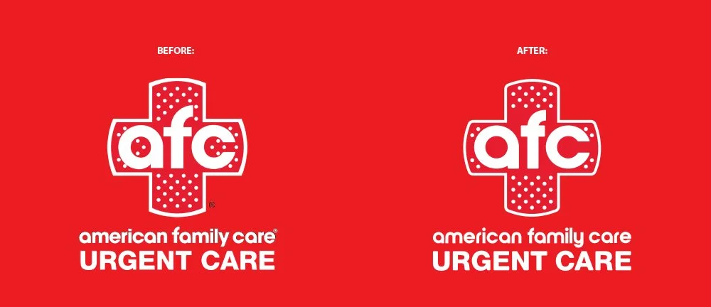
There is an AFC located near me. I’ve walked past it enough times that I started noticing things about their logo that bothered me. So I thought it qualified for another fun logo revision.
My goal was to clean up the logo, remove objects that I felt were visually distracting, and to create a visual balance between the letters, dots, and +.
Additionally I rounded the corners of the band aid to give the logo a softer feel, associated with care.
I still hate the lower gap between the F & C, but whatever....


The original afc appears to be something close to Nordique Pro Bold or URW Nimbus Sans Novus Black; but the shape of the a & c was not perfect, so I just used circles to get the balance.